Data Modeling
Selection of Tools and Techniques
Personas, Affinity Diagrams, & Journey Maps
Journey maps are an appropriate data modeling tool for Team Montréal’s study as they align with both the qualitative nature of the data and the research objectives. A journey map is a visualization that represents the process a person goes through to achieve a goal. In this case, the goal is the navigation of environments by using GPS applications. Since the data focuses on how individuals with mobility limitations use navigation tools, the journey maps allow for a structured way to document these experiences.
Creating a journey mapping starts with compiling a series of user actions into a timeline, which is then fleshed out with the user's thoughts and feelings. This approach is suitable for the qualitative data in this study, since it develops a narrative about how users interact with the navigation, the barriers they have encountered, and their responses to these obstacles. Eventually, this timeline is summarized and visualized in order to capture the main instances when the user faced accessibility issues or worked their way around inadequate features.
By putting the spotlight on the users' experiences, journey maps allow the visualization of specific pain points, such as, in our case, difficulty in route finding or a lack of key features related to ramp information. Moreover, journey maps show how users feel and adapt during the process; thus, they offer a clear picture of both practical challenges and emotional responses. This is important in addressing the aim of improving GPS applications for people with limited mobility, as it shows where the failure point for the existing systems occurs and also how they can be improved. Generally speaking, journey maps reveal solid opportunities to translate qualitative data into action.
Data Modeling Process
Personas
Affinity Diagrams
Accessibility Barriers
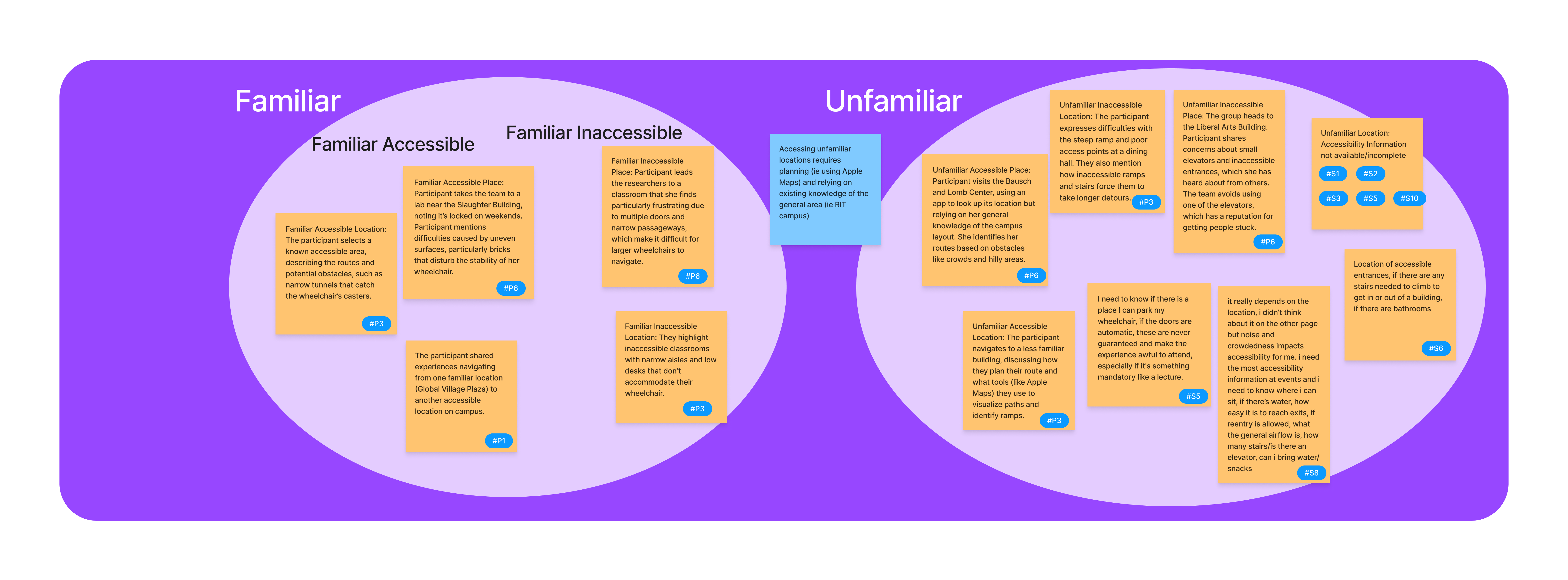
Navigating Accessible and Inaccessible Areas
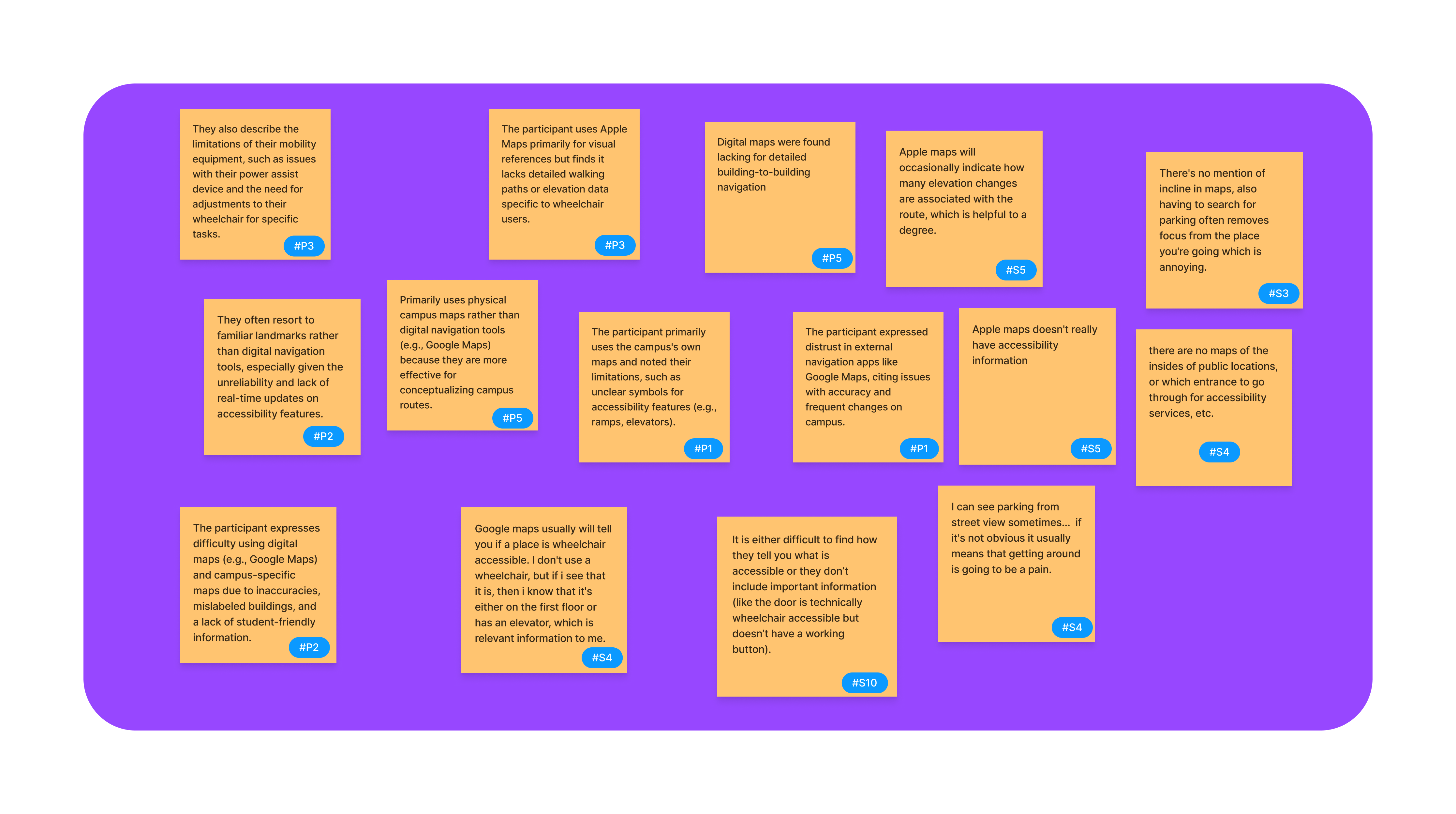
Use of Navigation Tools
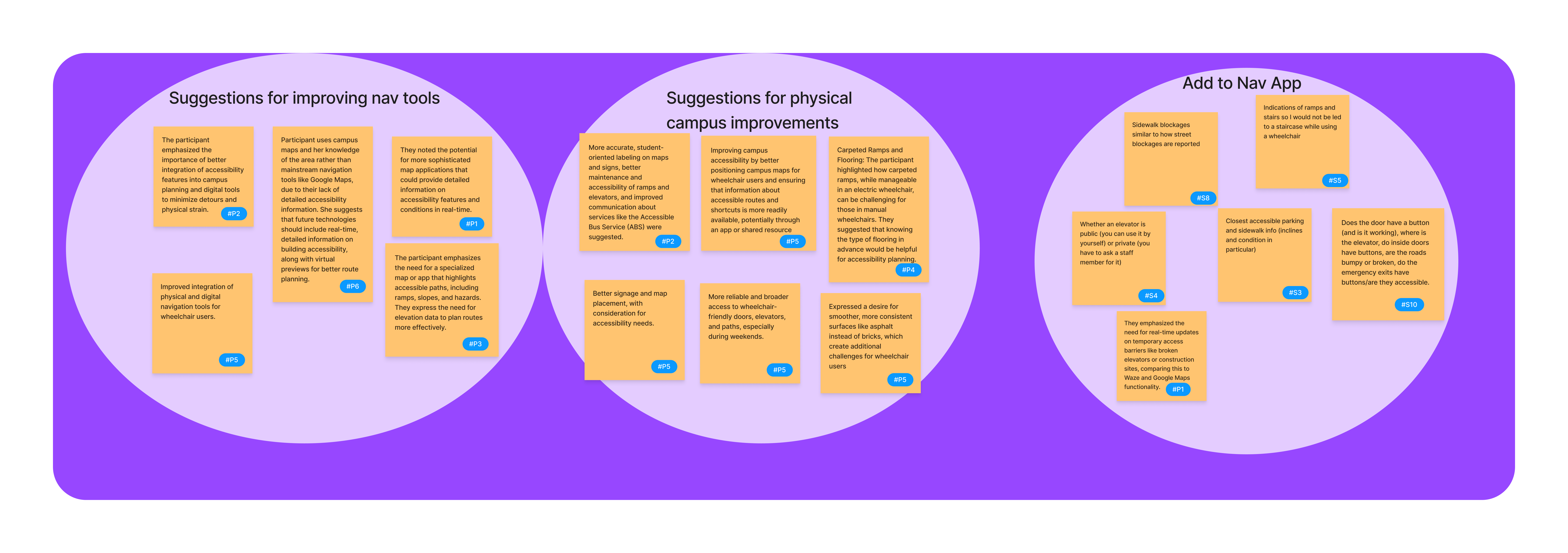
Suggestions
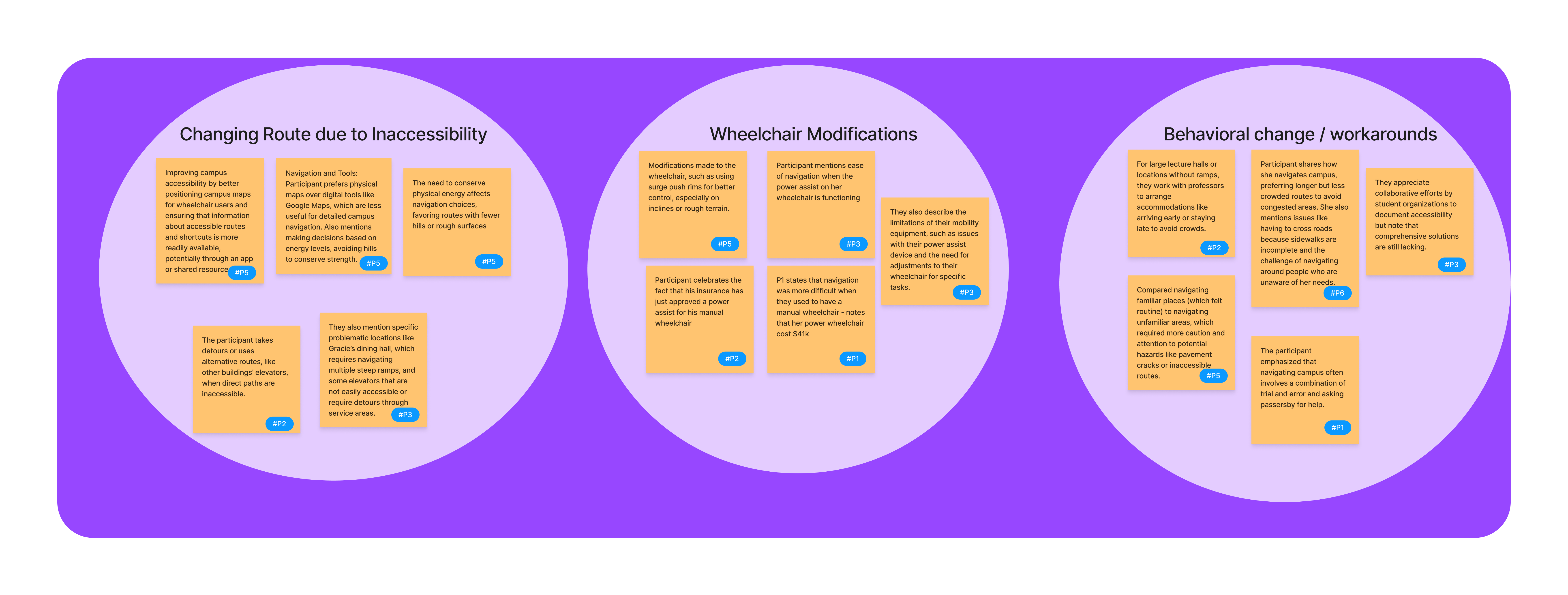
Workarounds
Journey Maps
Participant Data Presentation
Summary of Findings
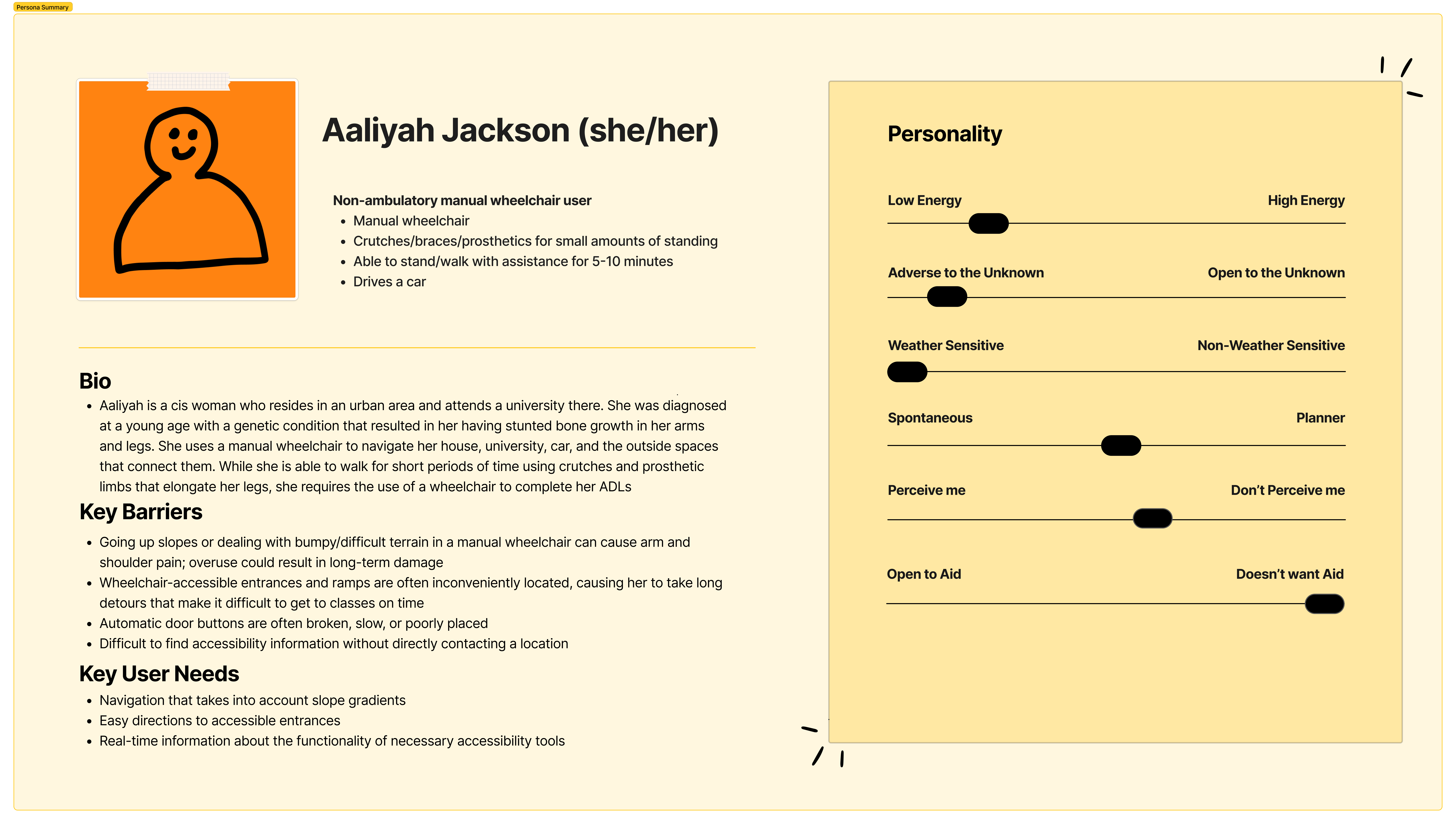
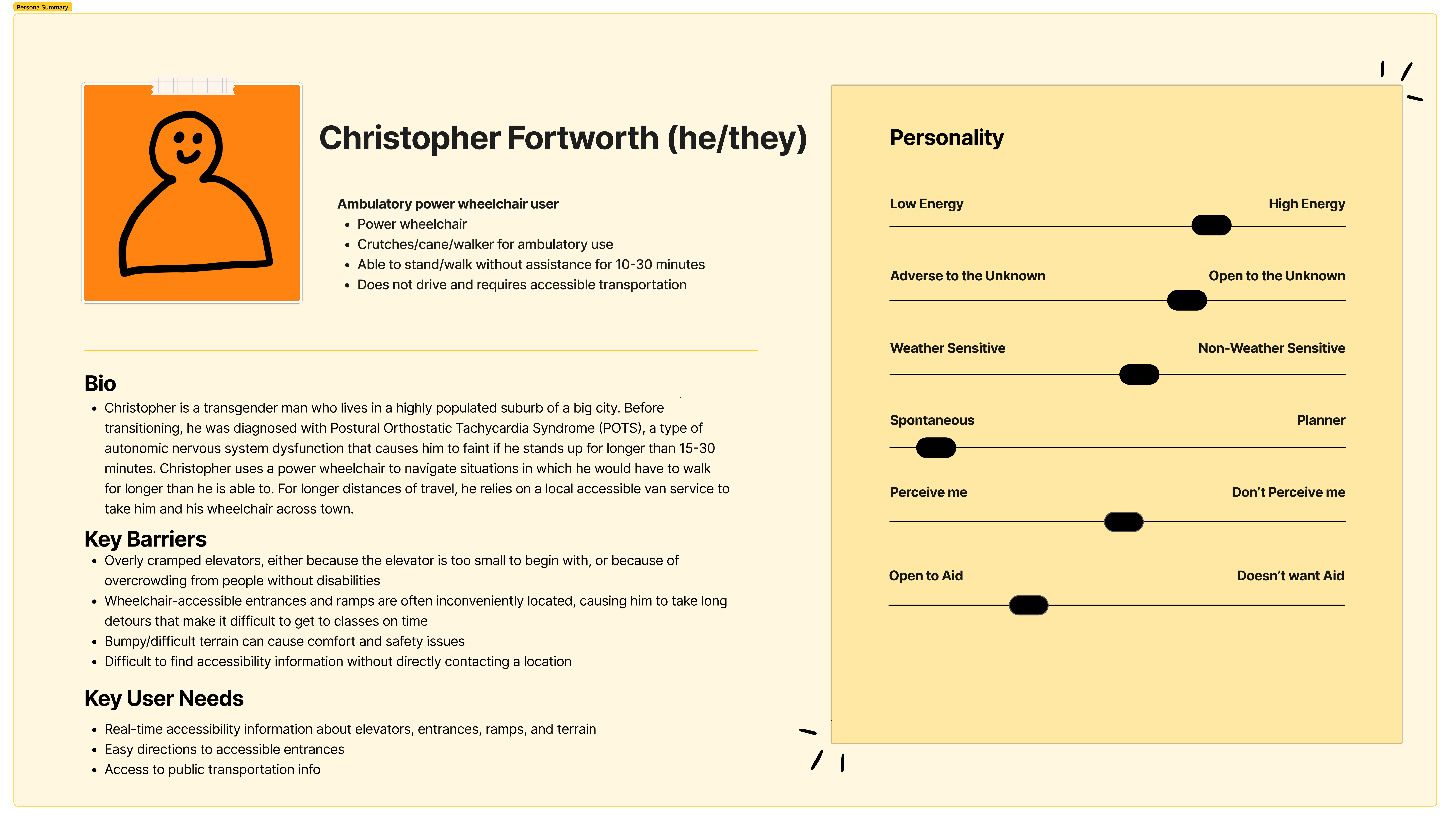
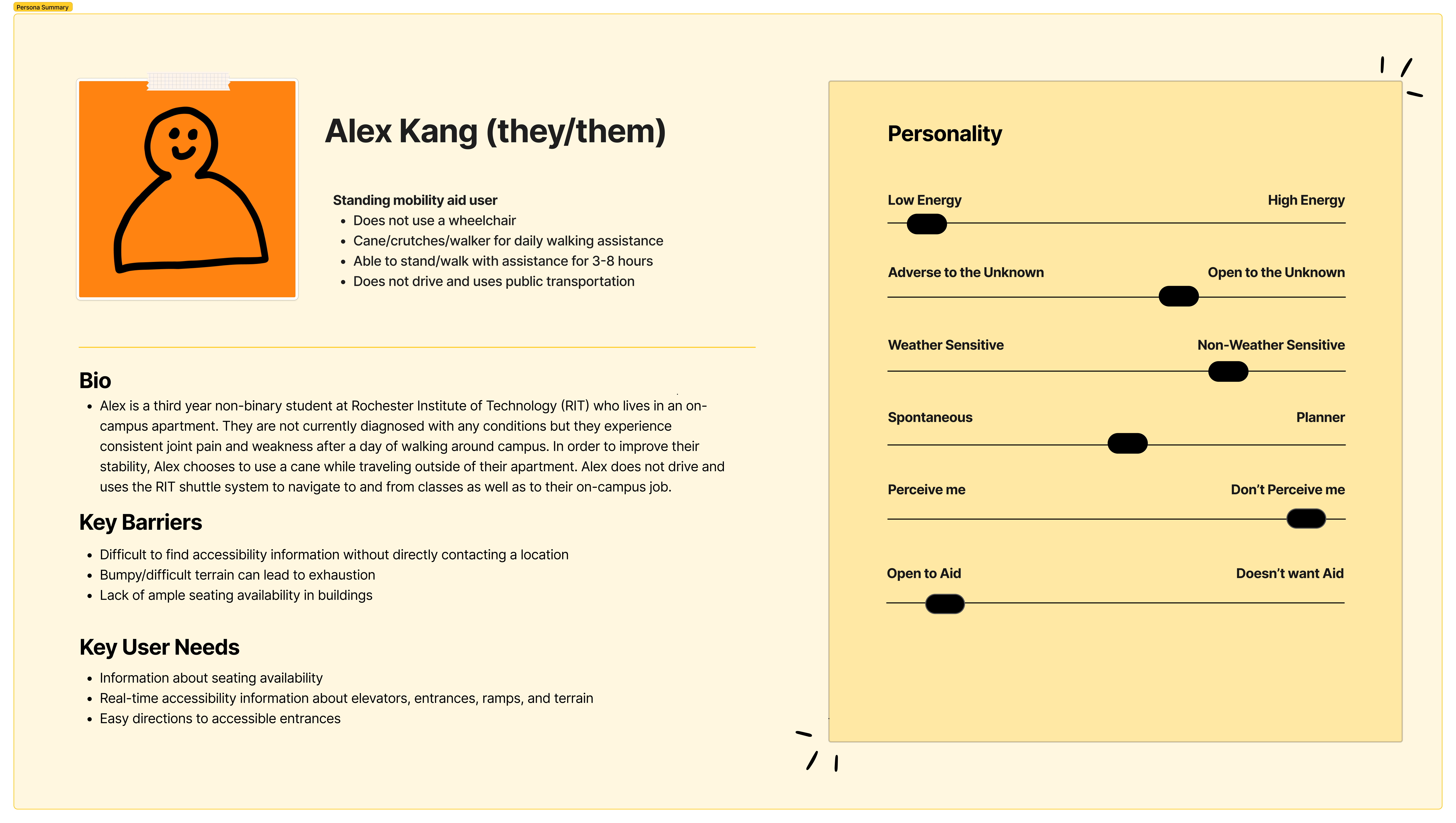
After analyzing the data from the contextual inquiry and the online survey, we constructed three key user personas that emphasize varying user needs corresponding to a person's specific mobility limitations. For example, a key difference observed was that manual wheelchair users must be very mindful of elevation changes, whereas this was less of an issue for power wheelchair users. Additionally, people who use canes or crutches need places to sit, but this information is not relevant to wheelchair users. Along with these distinctions, there were also several similar priorities among the user personas, such as real-time accessibility updates and easy-to-access information about elevator, ramp, and accessible entrance locations.
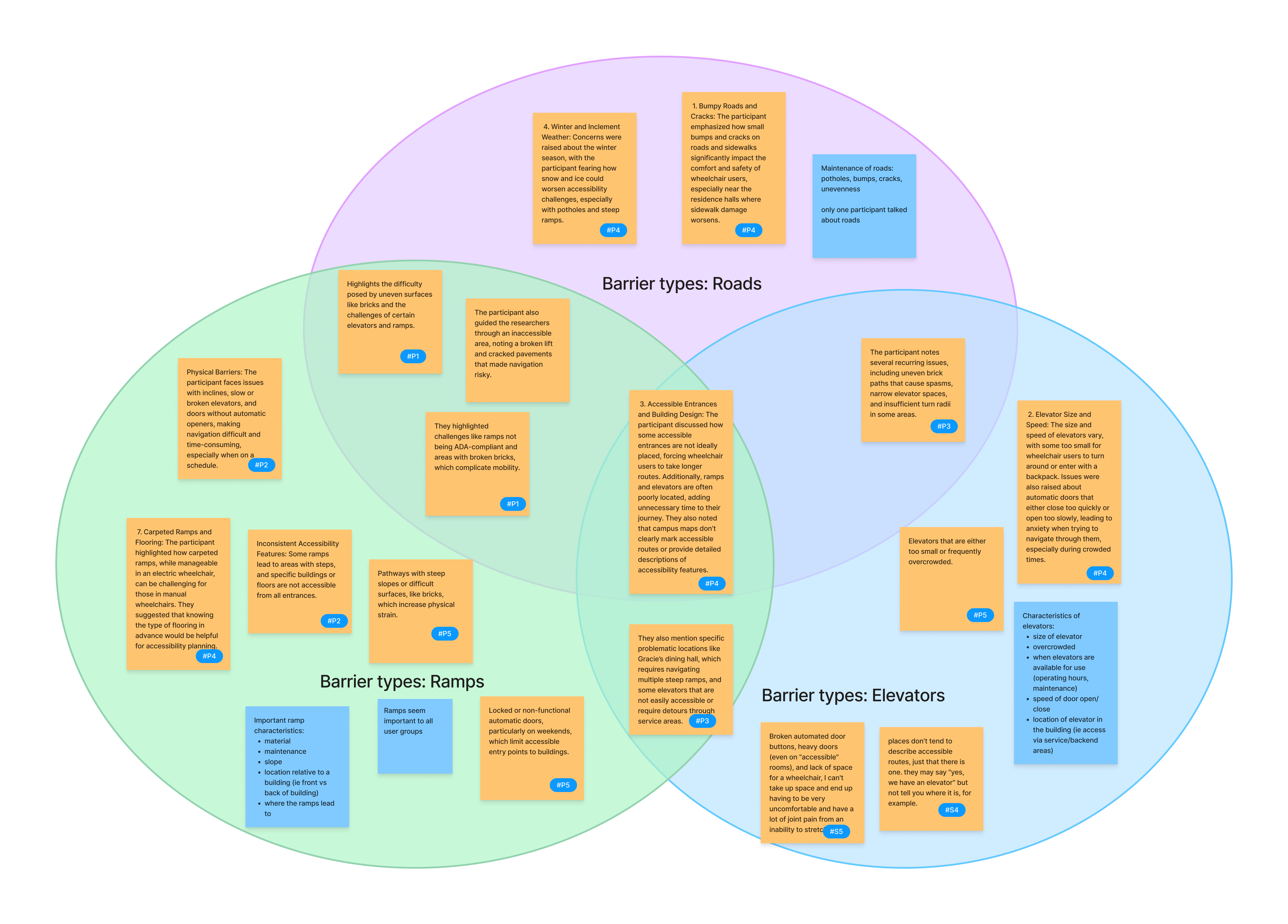
Our team also collaborated to create an affinity diagram using key points from each participant in the contextual inquiry. Our analysis resulted in five main types of insight from these inquiries: specific types of barriers, the difficulty of navigating accessible and inaccessible areas, current use of navigation tools, suggestions, and workarounds. Three main types of barriers were identified: roads, ramps, and elevators, which are all crucial tools for individuals with mobility disabilities. Several complaints about current navigation apps were identified, especially lack of clear accessibility information. Suggestions from participants included suggestions for improving navigation tools and apps, as well as suggestions for physical accessibility improvements on the RIT campus. Workarounds included changing route because of inaccessibility, wheelchair modifications, and behavior changes.
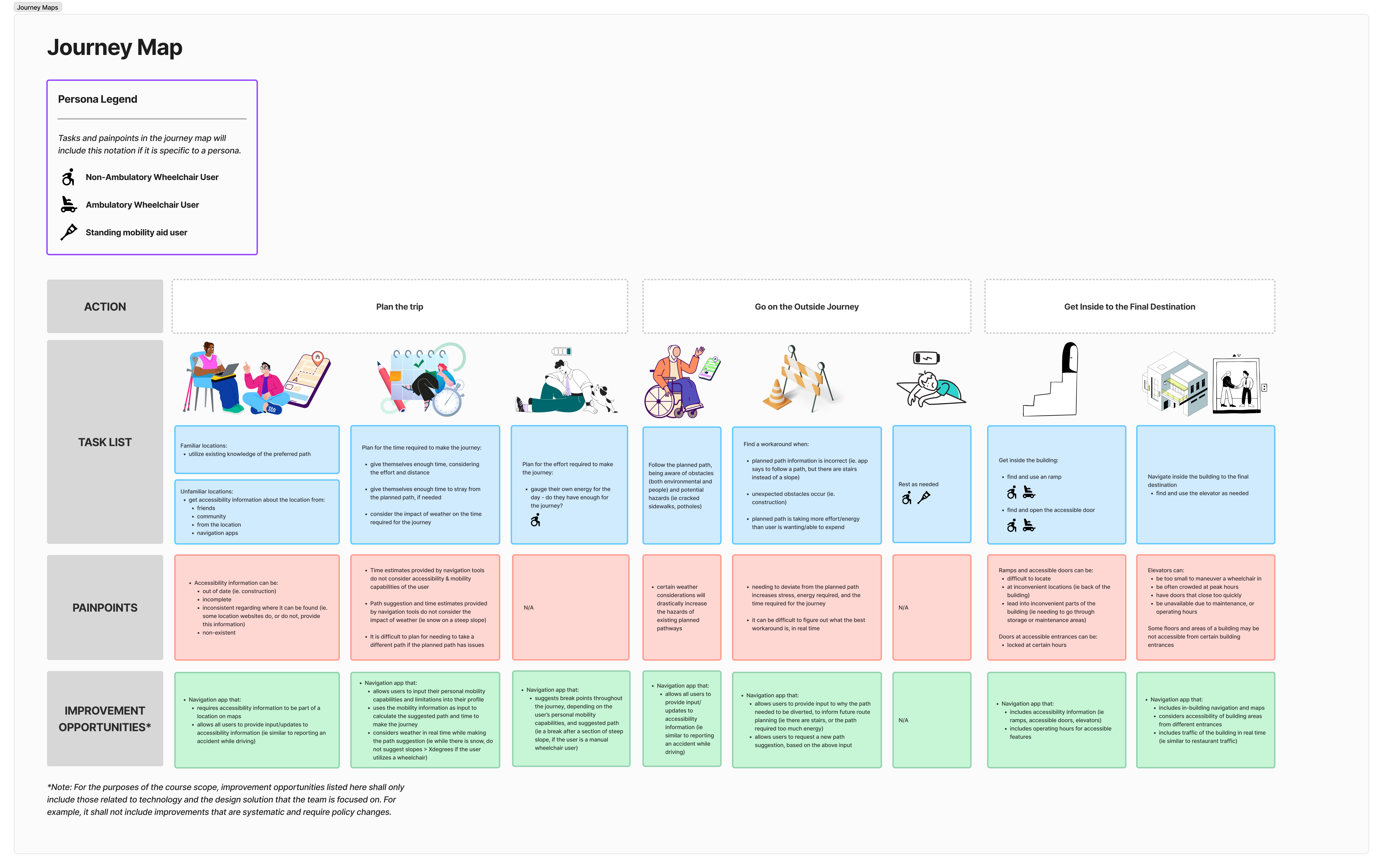
Using data from both the contextual inquiries and the online survey, we created a journey map to model the typical experience of an individual with a mobility disability navigating to a location. The first stage of this process is planning the trip, during which a person can encounter several obstacles, such as lack of accessibility information availability and difficulty scheduling a time to go. The second step is going on the journey, which often involves detouring from the originally planned route or finding workarounds to accessibility barriers. Finally, in the third step, the individual must navigate to an accessible entrance and likely navigate to an elevator inside the building, which can be difficult especially in unfamiliar buildings.
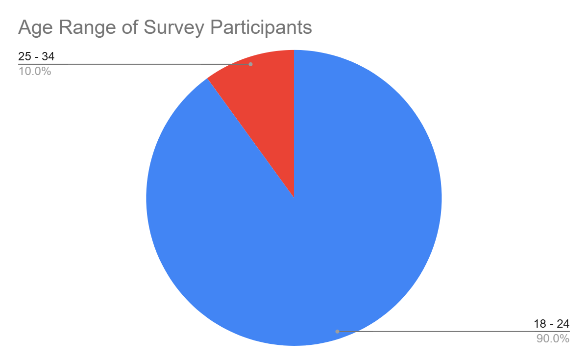
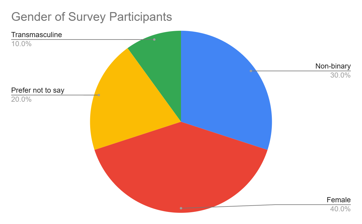
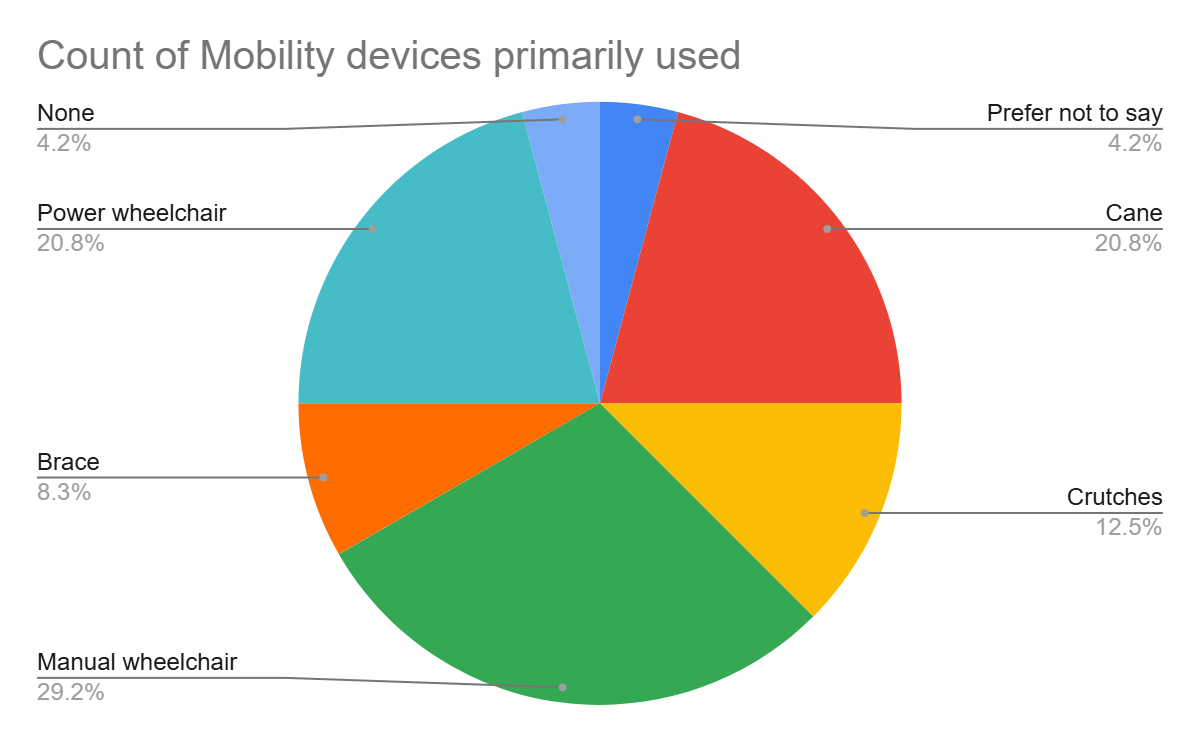
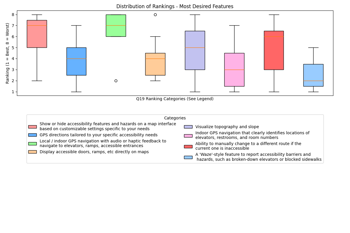
A descriptive statistical analysis of the data from the online survey revealed that the majority of respondents were between 18 and 24 years old, which is likely because we advertised it on the RIT campus. The participants in the online survey used a variety of mobility devices, with some participants reporting that they use multiple. From the features offered in the survey, the most highly ranked in terms of usefulness were a Waze-style reporting system for barriers, indoor GPS navigation with elevators, and displaying accessible entrances and ramps directly on maps. This data, along with the user personas, affinity diagram, and journey map, was used to generate our prototype functions, UI considerations, and user requirements later in this document.
In-Depth Analysis
Research Objectives:
- To understand the challenges navigation applications pose for individuals with limited mobility.
- To find if there is a requirement for a navigation system for individuals with limited-mobility by learning about the pain-points and user needs.
The key accessibility barriers identified by participants included roads, ramps, and elevators, and regardless of their mobility device, these obstacles were common to all users. For ramps, several important characteristics emerged. These included the slope, which impacts the ease of use for manual wheelchair users, the material and its condition (whether it is well-maintained or slippery), and the location of the ramp relative to the building entrance. Another key concern was where the ramp leads once inside the building, as users need clear paths to reach accessible areas.
Coming to elevators, another critical feature for users, participants mentioned their size and availability as key factors. Additionally, the operating hours of elevators, as well as maintenance schedules, were important as unexpected outages can create significant barriers. Many users also mentioned the location of the elevator within a building and the tendency for overcrowding–particularly in larger facilities.
As for roadways, participants pointed to the importance of maintenance, including the condition of the surface—potholes, cracks, and unevenness all posed challenges. Such information is often overlooked despite being important to individuals with limited mobility. The slope of roads is another significant factor as steep roads are a major issue for those using mobility aids.
Finally, navigating unfamiliar areas brought additional challenges, as users often required advanced planning and some prior knowledge of the area. The main pain-points we observed were obstacles, crowds, and inaccessible routes which needed to be avoided; these made navigating more difficult without reliable information. In terms of navigation tools, many participants noted inaccuracies or missing information in current digital apps, particularly the lack of updates in real time. A shared priority across participants was the need for real-time information, emphasizing that up-to-date accessibility details are crucial for navigating effectively. Users also pointed out that there was a shortage of specific accessibility information, including details about building-to-building navigation, indoor maps, and incline-related data. The degree of accessibility information provided by existing tools was often inadequate for users with mobility impairments, creating a need for a navigation tool which fulfilled their needs.
Statistical Analysis
Statistical analysis was undertaken on the results of the online user survey.
Question 9: “When you are able to find accessibility information about a location, how do you typically access this information?”
This question attempts to ascertain the methods and tools that participants currently use for the purpose of navigation. The most frequent responses for this question were analyzed by generating a series of 2x2 contingency tables for each pairwise combination of the top selections, and evaluating each with a 2-sided Fisher’s exact test. A statistically significant correlation (p=0.015) was found between participants who elect to ask for tips from others who had already been to the location, and participants who use word of mouth in the community. These options were the most social solutions for navigation, and suggests that there is a subgroup of participants who may appreciate social solutions to navigate and sharing of tips. This sentiment was also reflected by different participants in the contextual inquiries.
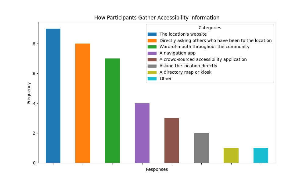
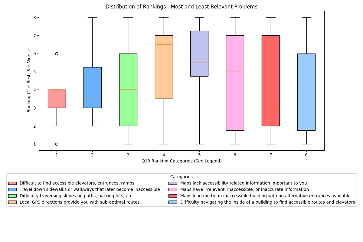
The distribution of rankings of problems when navigating were reflected in both survey results and contextual inquiry analysis. The distribution of proposed solutions had clear trends, with participants expressing an emphatic desire for a "Waze-like" feature set to view and report accessibility obstacles in real-time, including ephemeral obstacles. They also underscored a gap in existing tools when it comes to navigating indoors.
Qualitative data coding
Finally, our contextual inquiries produced approximately 300 pages of transcripts which needed to be coded. Two researchers underwent an inter-rater reliability exercise on the corpus of transcripts. This resulted in a Cohen's Kappa of 0.461, representing a Moderate level of agreement. The primary source of disagreement was a different understanding of how we were classifying behavior which constituted "planning" vs behavior which constituted a "workaround."